NUVE INTERIORS
Nuvé Interiors is an interior design brand driven by the belief that thoughtful design has the power to shape how people feel and live every day. Rooted in listening and understanding, the brand creates balanced, welcoming, and timeless spaces by translating each client’s lifestyle, values, and story into interiors that feel both functional and deeply personal. The name Nuvé comes from the word “new,” representing fresh beginnings, renewal, and transformation. It reflects the studio’s approach to reimagining familiar spaces and giving them new life through natural materials, clean lines, and subtle elegance. More than a name, Nuvé is a mindset that celebrates growth, creativity, and the beauty of starting fresh.
Interior Design Studio
Nuve Interiors
2025/2026
The Brand
Nuvé Interiors began with a simple love for beautiful, intentional spaces and a belief that the environments we live in shape how we feel and show up every day.
From the very start, they were drawn to the quiet power of design. The way light, texture, and thoughtful placement can change a mood or make a space finally feel like home. What started as an idea grew naturally from small projects into a deeper purpose.
Today, Nuvé Interiors is built on helping people tell their stories through their spaces. Every project reflects a lifestyle, a vision, and the small details that make each client unique. We believe in warm, functional design that feels calm, lived in, and personal. For us, it’s not about perfection, it’s about creating spaces that feel real, meaningful, and truly yours.
Brand Strategy Overview
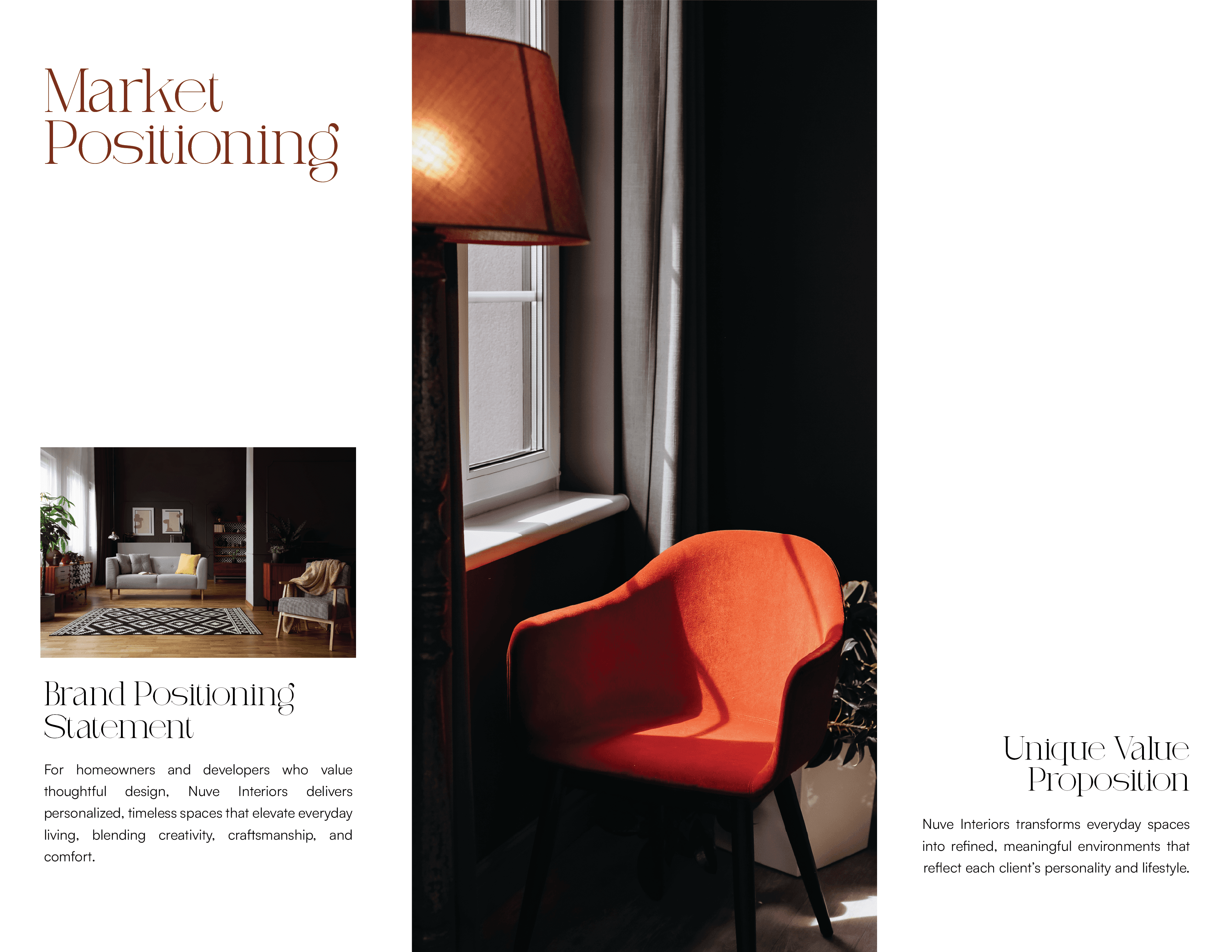
The strategy for Nuvé Interiors was built around one core idea: creating a brand that feels as considered and intentional as the spaces it designs. Before exploring visuals, the focus was on understanding the emotional role of interior design and how Nuvé positions itself within that space.
Nuvé is not about loud statements or trend driven aesthetics. It is about calm confidence, warmth, and quiet sophistication. The strategy aimed to reflect this by shaping a brand that feels grounded, personal, and timeless, one that speaks to people who value meaning, comfort, and thoughtful details in their spaces.
At the heart of the strategy is connection. Nuvé approaches design by listening first, understanding how people live, and translating those insights into environments that feel authentic and lived in. This informed every strategic decision, from the tone of voice to the choice of typography, color, and logo construction.
The brand was positioned as a boutique interior design studio, premium but approachable, refined yet warm. This balance guided the visual direction, ensuring the identity feels elegant without being cold, and modern without chasing trends.
Overall, the strategy set a clear foundation for the brand system, aligning Nuvé’s values, personality, and positioning into a cohesive identity that supports long term growth and consistent communication.


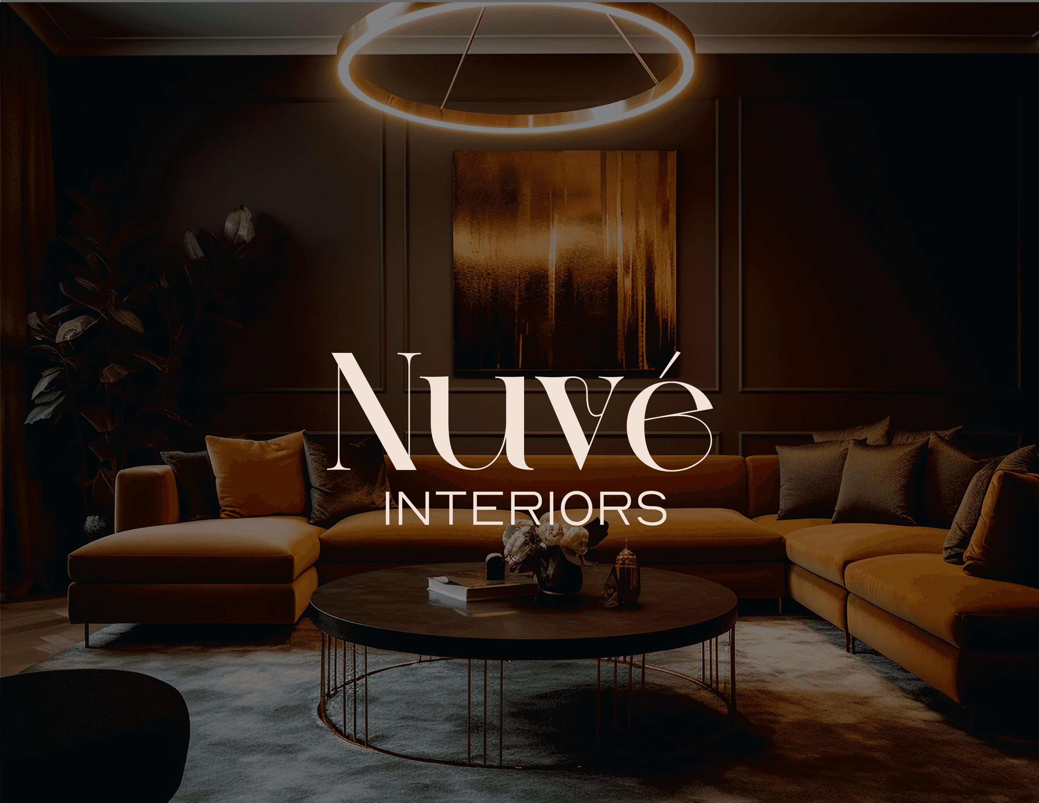
The Logo
The Nuvé Interiors logo is designed as a refined wordmark that reflects the brand’s calm confidence and thoughtful approach to interior design. Rather than relying on excessive symbols or decorative elements, the logo embraces simplicity and restraint, allowing the name itself to carry the brand’s identity.
The serif typography was carefully chosen to convey elegance, sophistication, and timelessness. Its soft curves and structured forms mirror Nuvé’s design philosophy of balancing beauty with functionality. The accent on the é adds a subtle sense of character and refinement, reinforcing the idea of renewal and fresh perspective that sits at the core of the brand.
Overall, the logo is designed to be confident without being loud. It feels modern but not trend-driven, expressive yet controlled. This makes it versatile across different applications while remaining true to Nuvé Interiors’ commitment to timeless design, thoughtful details, and meaningful spaces.
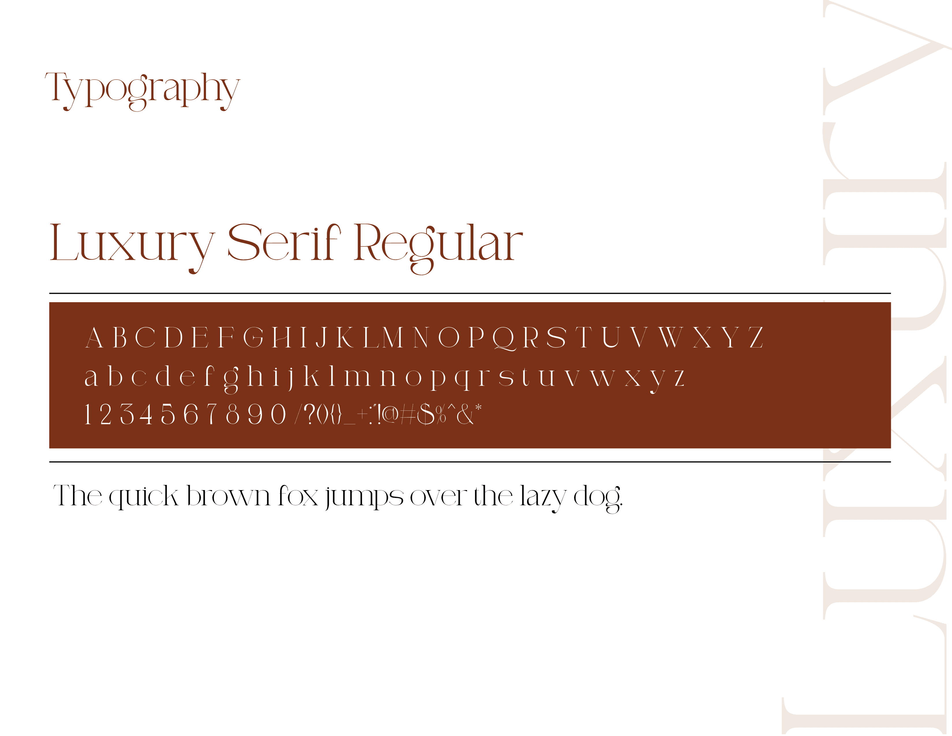
The Typography
In shaping the Nuvé Interiors wordmark, emphasis was placed on achieving a sense of balance, refinement, and quiet confidence through typography. The luxury serif typeface was chosen for its elegance, softness, and timeless presence, qualities that closely reflect the brand’s approach to interior design. Rather than treating the type as a static element, the focus was placed on how the letters interact with one another and the subtle stories that emerge within their spacing.
While refining the wordmark, the relationship between certain letterforms revealed moments of negative space that felt intentional and architectural. These small details echo the way Nuvé approaches interiors, where balance, proportion, and quiet structure shape the overall experience of a space. The accent on the é further enhances this sense of refinement, introducing a distinctive focal point that feels elevated without overpowering the wordmark.
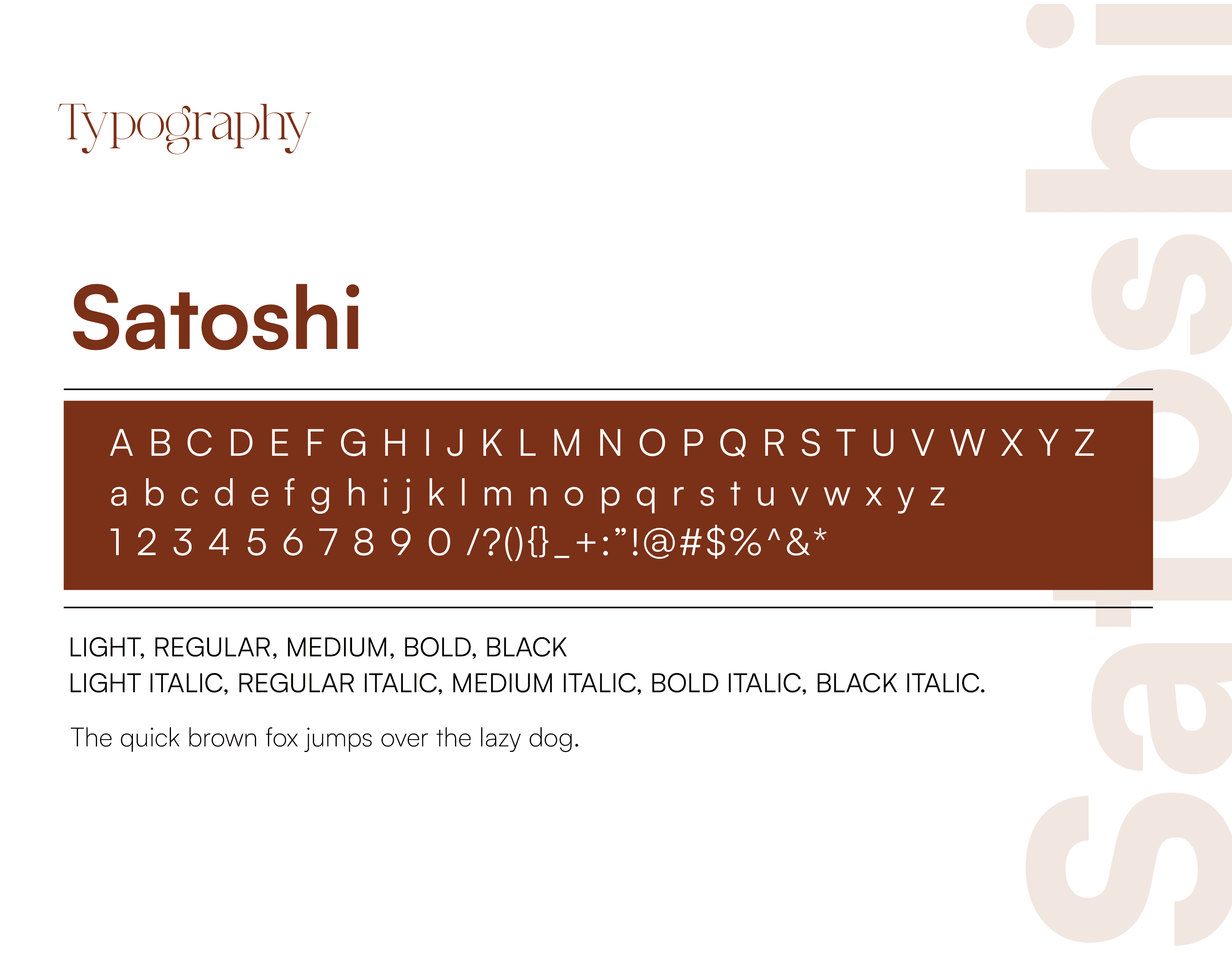
To support the logo and broader brand system, Satoshi was selected as the secondary typeface. Its clean, modern structure provides a strong contrast to the expressive serif of the logo, creating a balanced typographic system that feels both contemporary and grounded. Together, the luxury serif and Satoshi work in harmony, allowing Nuvé Interiors to communicate warmth, sophistication, and clarity across every touchpoint while reinforcing the brand’s philosophy of thoughtful design and intentional transformation.
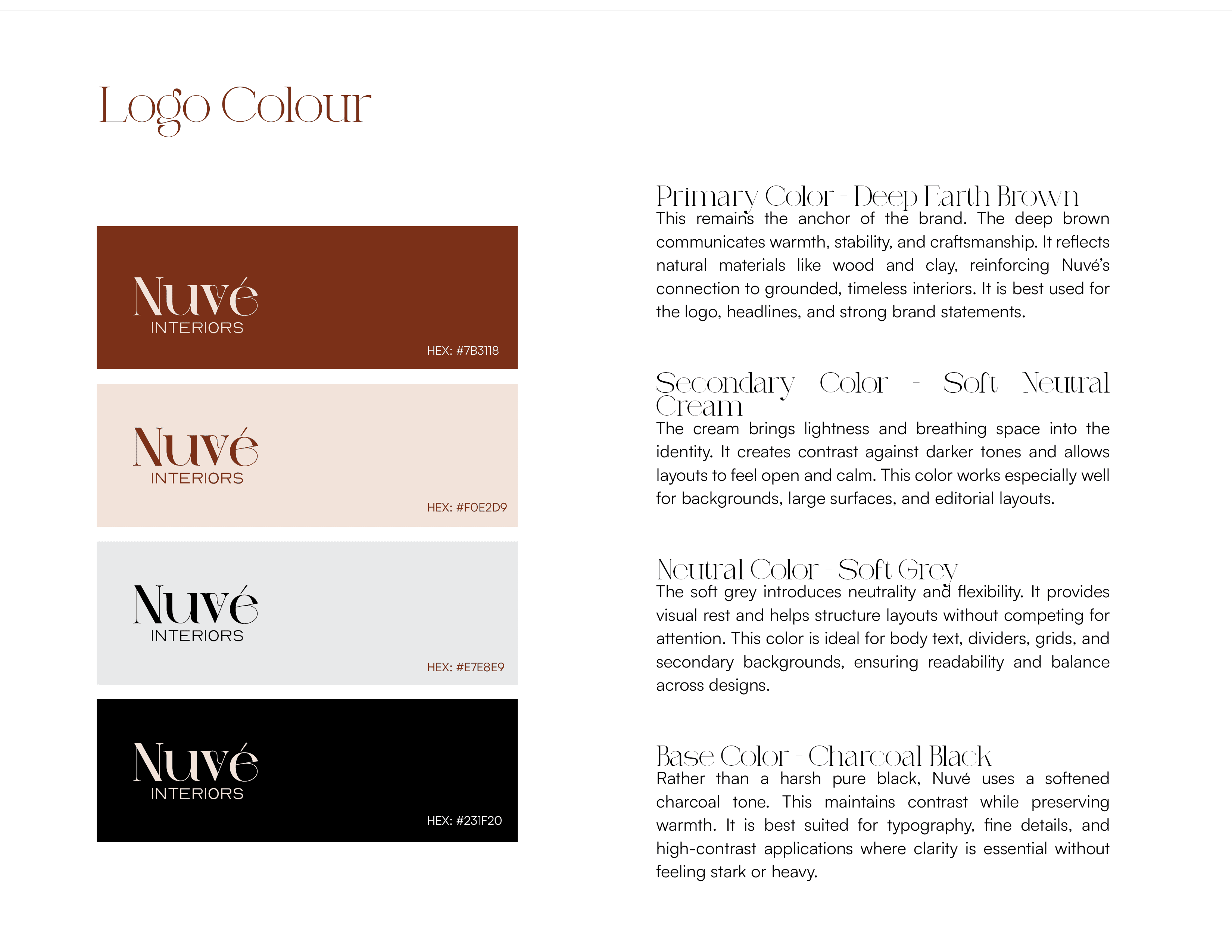
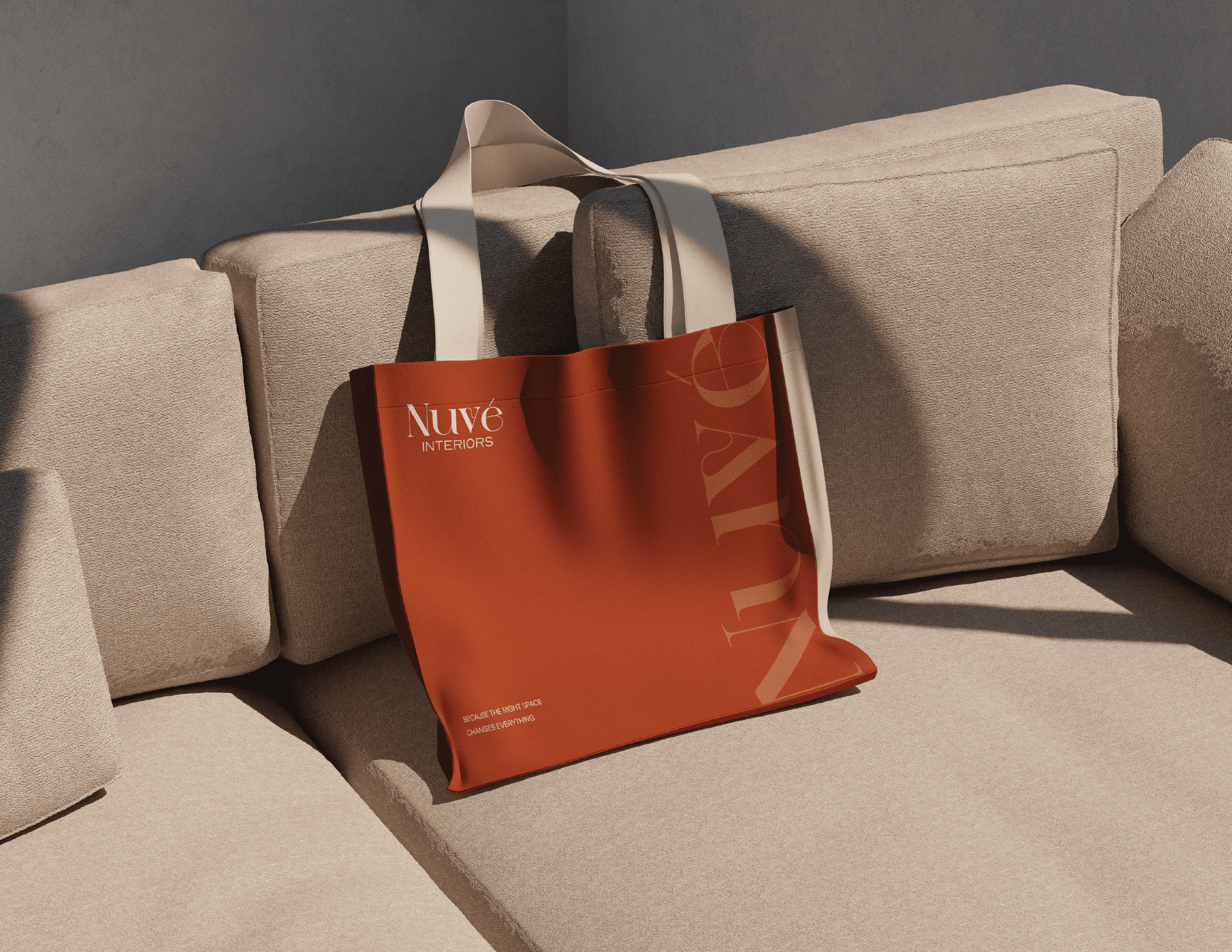
Colour Palettes/ Brand Application
The Nuvé Interiors color palette is built around warmth, balance, and timeless appeal. Deep Earth Brown anchors the brand, reflecting craftsmanship and natural materials, while Soft Neutral Cream adds lightness and calm to create open, breathable layouts. Soft Grey provides structure and flexibility without distraction, supporting readability and balance, and Charcoal Black delivers contrast with a softened warmth. Together, the palette creates a refined, grounded visual language that feels elegant, welcoming, and intentionally designed.